

Where do you get your water from, and is it safe to drink? Advances in EPA modeling delivers for drinking water justice
Who Gets Water from Whom?
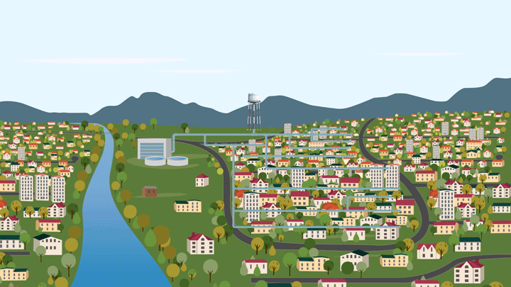
For nine out of ten Americans, tap water comes from a community water system. There are nearly 50,000 of them across the country, and every day those systems pump, treat, and transmit water to an estimated 315 million people. While for many of us it’s easy to take clean, affordable drinking water for granted, not all water users share that experience. Roughly one in ten people are served by a utility with recent health-based violations. The same percentage of users are considered water rate burdened—meaning they pay more than 4.5% of their income on water and sewer services. How do we know all that? Because of local, state, and federal data sources like the EPA’s Safe Drinking Water Information System, or your own utility’s Consumer Confidence Report.
So while such incredibly detailed information on utility operations, testing results, and compliance history has long been at our finger-tips, it only went so far. The data wasn’t contextualized by the people actually impacted by unsafe (or unaffordable) drinking water. We could see the names of water systems with violations, but not affected communities. That long-standing status quo inhibited our ability to answer the basic, but vital, questions at the heart of drinking water equity.
Questions like: Do high water costs burden people equally by income and race? or, Are the young, elderly, and vulnerable, more likely to drink contaminated water?
As a result of that scenario, troves of key data on utilities sat on an island—cut off from their geospatial context, and eclipsing our view of where and how people were affected by the cost and quality of their drinking water. Why? Because, unlike test result reporting and enforcement actions, utilities are not required to submit geospatial boundary information to the EPA. Only 17 states currently collect and publicize this information, and in the absence of a nationwide effort to change that, a truly national understanding of who gets their water from whom is impossible.

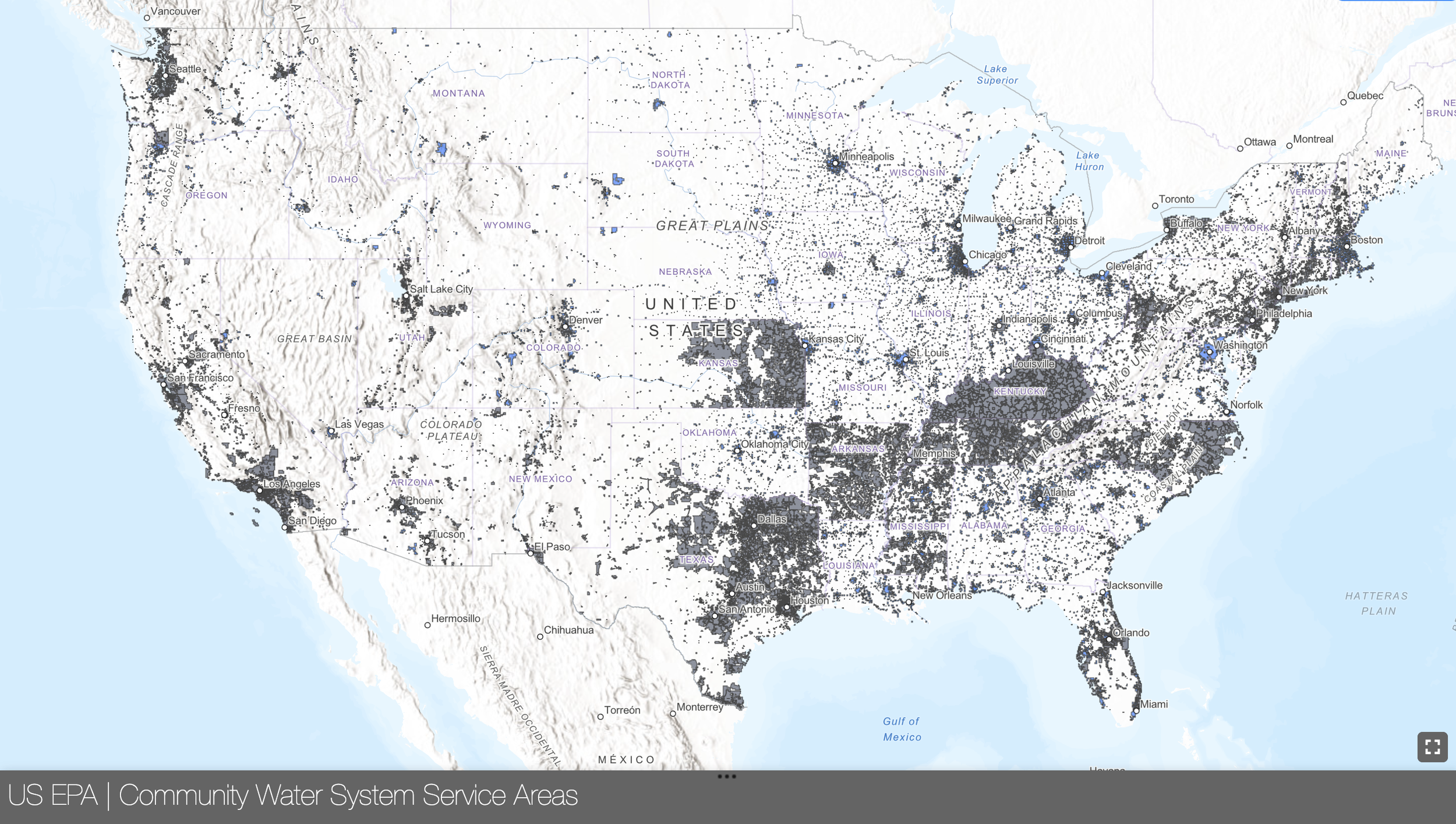
Screenshot of EPIC’s map showing drinking water service area boundary data supplied by states vs. the EPA’s modeled data.
Composed of three data quality tiers drawn from vetted state and utility data and circular boundaries (i.e., those estimated by facility address), our provisional national dataset marked a significant step towards a comprehensive federal map. Soon after, the US Geological Survey (USGS) followed suit and published modeled boundaries of large utilities—capturing an estimated 269 million, or 85% of community water system users. Both datasets had their strengths, but neither accurately captured all systems. That changed this month: the latest—and monumental—step in this data journey was the EPA’s July 2024 release of their inaugural Community Water System Service Area Boundaries. This first-of-its-kind, comprehensive map of drinking water service area boundaries is the culmination of years of effort and sustained collaboration with EPA and others; and we couldn’t be more excited by what it means for the future of water justice.
EPA’s new dataset includes additional state-provided boundaries from Mississippi, Tennessee, Kentucky, and Florida, as well as improved data for small utilities like mobile home parks.
EPA utilized modeling techniques to vastly improve the geospatial water system service area boundaries.
Created by EPA’s Office of Research and Development, in collaboration with more than a dozen other federal offices, EPA leveraged decision trees and random forest models to interpret a dozen data sources—including high-quality state datasets from Connecticut, New Jersey, and California; impervious surface coverage; and proximity to the nearest public water supply intake location. The resulting model estimates the likelihood that any given Census block is served by a community water system. From there, drinking water service area boundaries are apportioned to known systems with a unique public water system identification number (known as “PWSID”). In situations where state boundary data was available, EPA used it in lieu of modeled data. The final result is a dataset with high quality service area boundaries—ones that cover 99.3% of non-transient community water systems across the country.

Table of comparisons between EPIC and EPA boundaries showing similar population numbers, but with more refined boundaries and higher population density in EPA’s dataset (especially for modeled boundaries).
How do these new boundaries compare with EPIC’s provisional dataset?
Our analysis comparing EPA’s dataset to EPIC’s earlier iteration revealed plenty of overlap between both service area boundaries for the majority of systems. In dataspeak, we found that, for 93% of utilities, there was a 5% difference in total population served, utilizing population weighted interpolation. On average, that means the difference between both datasets was 72 people—with an average utility served population of 6,600. Where we do see differences is in smaller water systems serving between 15 and 500 people (again, according to our dataset). Roughly 45% of these small utilities had “tier three” boundaries in our dataset based on addresses—a data tier where our accuracy confidence was lower given certain data gaps. Encouragingly, EPA improved these boundaries by utilizing parcel and building data to better ascribe boundary information, ultimately providing a much higher resolution “picture” for smaller utilities—which, notably, are more prone to financial constraints and other issues.
Beyond general population trends, we also examined how demographic groups were represented between the two datasets. Our analysis shows significant overlap for state provided boundaries, and moderate variation for small demographic proportions in modeled boundaries. Overall, we found that EPA boundaries have a higher proportion of minority populations, particularly for smaller utilities.
EJScreen Updates!
EPA’s new dataset also enabled the first-of-its-kind federal drinking water justice metric in EPA’s EJScreen. A longstanding environmental justice screening tool, EJScreen displays numerous metrics tied to environmental injustice, public health, and other key considerations—from lead paint to traffic proximity for census block groups around the country and more. Until recently, a percentile based on drinking water services was impossible, due to insufficient boundary data. Now, Americans can compare their utility based on non-compliance in the past five years to neighbors and national averages. That’s huge news. Have questions about how the new metric works? Learn more about it here!
Looking Ahead.
As we think about where this exciting work’s headed, there’s plenty more questions EPA’s milestone dataset can help us answer. Top of mind for us, are these potentially high impact use cases:
Drought planning: How is the population growing relative to water supply availability?
Regionalization: What is the reach and capacity of neighboring water systems?
Public Health: Who is currently impacted by unsafe drinking water, and whose water was unsafe 5, 10, 15, or 20 years ago?
Emergency Response Planning: What neighboring communities might be impacted in a chemical spill or disaster situation?
Finally, we are keen to dive into these and other research questions—and welcome any collaboration opportunities for doing so. Reach out if you have questions about this work or are interested in advancing all things drinking water data!
For further reading (and watching), be sure to check out these resources:
EPA’s Drinking Water Service Area Boundary Dataset—including access to the data, FAQs, technical documentation, and a place for sharing user feedback.
EPIC’s recent webinar celebrating and exploring EPA’s new dataset with over 300 advocates, state and federal staff, NGOs, and data experts working on drinking water justice.
A compiled set of great questions (and other resources) from our webinar with EPA.