

Water service area boundaries enable new insights - including identifying water systems that are most in need of funding to address drinking water inequality.
In May, EPIC, SimpleLab, and the Internet of Water Coalition released a provisional national map of drinking water service area boundaries to support the design and implementation of water and climate programs at the federal, state, and community levels. Since then, EPIC has published a series of blogs that explore why water service area boundaries are particularly important to individuals, communities, water system managers, state and federal agencies, and tribes. This blog post is the 4th of that series and focuses on how this data can be used to evaluate which communities should be prioritized for funding to address health-based drinking water violations.
Guest Author: Phil Cork, a fellow with the Massive Data Institute
The Massive Data Institute is collaborating with the EPIC to better characterize who gets water from who, who lacks access to safe, reliable, affordable drinking water, and, finally, to assess to what extent these communities have received funding to improve their water systems.
The Infrastructure Investment and Jobs Act, along with the Inflation Reduction Act, has made available an unprecedented amount of federal funding to bolster equitable access to safe drinking water across the country. As these resources are allocated, it is vital to evaluate which communities should be prioritized and track if investments are being dispersed to those water systems. This consideration must take into account communities negatively impacted by their current drinking water quality, those that have been historically underfunded, and those that are at risk of further environmental vulnerabilities. Each of these steps requires accurate, accessible data that has not historically been available or easy to analyze. We are tackling these data gaps and analysis challenges to support policymakers, advocates, and communities in realizing Justice40’s goals.
Step One: Combining geospatial and demographic data to characterize communities
The first step involves combining demographic data and water system locations. Since water systems are not coterminous with municipal nor census boundaries–their service area boundaries often overlap with multiple administrative jurisdictions– it is difficult to correctly characterize the underlying populations. To overcome this challenge, our team at MDI has developed a Spatial Data Toolkit that allows for evaluating and analyzing data across different sets of boundaries.
Using this new tool, we are able to calculate how many census tracts within each water system consist of communities denoted as ‘disadvantaged’ (DACs) according to the Climate and Economic Justice Screening Tool. This addition brings together data points that previously existed only at disparate levels of geographic detail, allowing us to now compare and analyze water systems based on the communities they serve.
Step Two: Evaluating who has access to safe drinking water
Next, we introduce data about the quality of the drinking water provided by each water system from the EPA’s Safe Drinking Water Information Systems (SDWIS) data. Following the Center for Geospatial Solutions Internet of Water Coalition’s preliminary methodology as outlined in this blog (and available in detail here) we evaluate whether a community water system has had health-related violations of water quality standards for more than thirty days in the last two years. With the service area boundaries data, our team could connect violations data with demographic data, which indicates disadvantage, to evaluate whether DACs more frequently lack access to safe drinking water.
Step Three: Linking funding data with the geospatial information
Having characterized the communities that water systems serve and water quality, the next step is to add data regarding which water systems have received funding through the Drinking Water State Revolving Funds (DWSRFs) to improve drinking water infrastructure. States publish lists of the projects they intend to finance with DWSRFs annually. This information in non-standard and often difficult to use PDFs. Another team of MDI Scholars transformed these documents into usable data (as outlined in this blog). We combined the data on which water systems received SRF awards in 2022 with data on demographic and water quality to further our understanding of the alignment between the amount of funding a water system receives relative to water quality impacts.
Step Four: Insights from the data
Following the methodology above, we can easily visualize which water systems that 1) have persistent health-based violations, 2) have received FY2021 DWSRF funding, and 3) serve disadvantaged communities (per CEQ’s definition in the case of this blog). This is the first assessment of this data and there are many more ways we could evaluate this information. For now, we are keen to share these preliminary results in Texas to demonstrate what is possible for SRF administrators, policy makers, and advocates when equipped with easy access to this information.
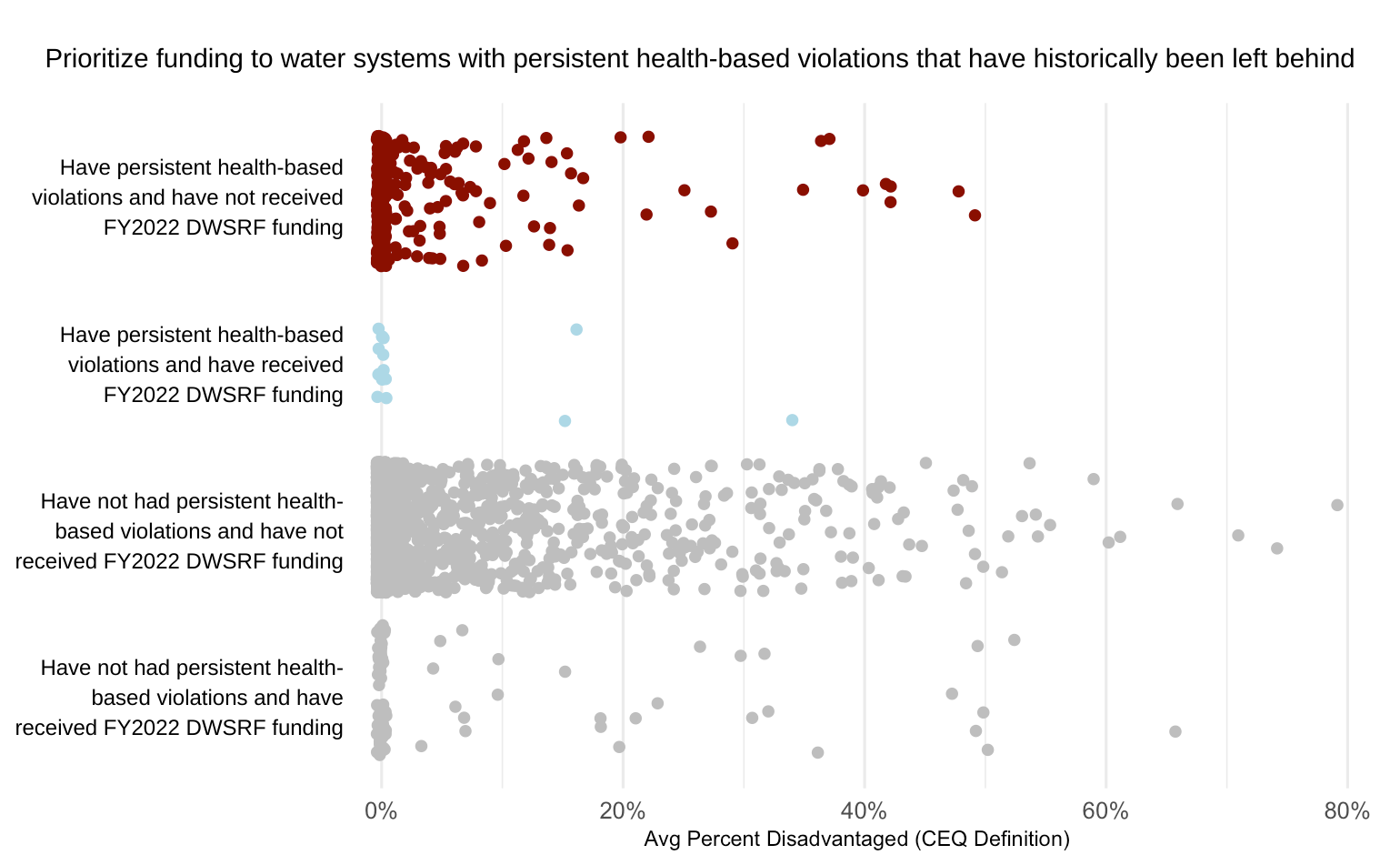
Each dot on this graph is a community water system in Texas. Water systems are then put into one of four categories based on those that have received DWSRF funding, as well as those that have persistent health-based violations. The x-axis then shows how many census tracts within a water utility’s service area boundary are considered disadvantaged per CEQ’s definition.
By evaluating this data in Texas, a few insights stand out:
Eight percent of Texas water systems reported health violations of some kind for more than 30 consecutive days since 2020.
Where health-based violations have been funded, only one system serves an area where more than 20% of the communities are considered disadvantaged.
Six community water systems in Texas serve areas where more than 40% of the communities are considered disadvantaged and have experienced persistent health violations and have not received funding.
By implementing the tools and processes developed by MDI and the use of EPIC’s provisional water utility service area boundaries dataset, we are now able to more accurately identify these water systems most in need of additional funding to address drinking water inequality for underserved communities. But there is more work to be done.
Where to go from here?
For now, we were only able to do this analysis for a handful of states - extending it to all fifty requires support and collaboration from local, state and federal government agencies, as well as community-based partners. First, it requires high-quality spatial data to map out who gets water from who, and we currently only have that information for about half of the US population. While EPIC has made important strides in improving both the scope and quality of service area boundaries data, additional progress will require collaboration with state and local governments to extend this information across all fifty states. Second, this process also depends on easily accessible information about funding allocations from the Drinking Water State Revolving Funds. The quality of these documents varies by state, but my colleagues at MDI and EPIC have highlighted specific steps that can be taken to improve interpretability and access. Now is the time to build out the data and digital infrastructure to understand who lacks access to safe, reliable and affordable drinking water so we can properly prioritize outreach, engagement and support to communities that have historically been left behind, and ensure we can meet (and exceed!) our Justice40 goals.
Support for this work was received from the Bezos Earth Fund.